PROJECT UPDATE
One website, with a clearer place for my work and creator content
· By Jethro Frane · 2 min read
Why my professional pages, shared blog, and Jethnology creator hub now live in one simpler website.
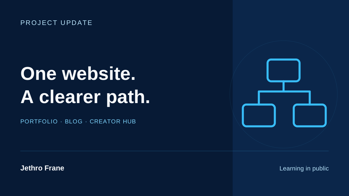
I wanted my website to be easier to understand. A recruiter should be able to find my experience and CV. Someone interested in Jethnology should be able to find my videos and creator channels.
Keeping those paths in one website feels more manageable for me.
Give the professional pages a clear purpose
The homepage, experience, projects, and resume focus on my work and skills. Email, LinkedIn, and GitHub are the main professional contact paths.
That lets someone inspect the profile without sorting through every social channel I use.
Give Jethnology its own space
The creator hub connects my creator profiles, videos, and available product picks. My YouTube channel includes tech reviews, AI experiments, and personal content. It has room to be itself there.
The blog is shared. A case study can explain a web project; a creator article can share a useful lesson from making content. Clear topics help the reader choose.
Make small details easier to use
The CV opens in a new tab. Article cards show an estimated reading time. Topic filters help readers find the kind of post they want. Project pages keep their real screenshots and distinguish demos from other work.
None of those changes needs a long explanation for the visitor. They should simply make the next step easier.
Keep the profile accurate
I’m still improving the website with AI assistance. I want the resume, project labels, and article wording to agree about what I actually did.
For me, a cleaner profile means fewer unclear paths and claims I can explain. That is what I want to keep maintaining as the site grows.
Decide what belongs on each path
I use the visitor's purpose as the starting point. A recruiter needs a short introduction, accurate experience, selected work, and a readable CV. A viewer looking for a gear review needs a creator channel and relevant examples. The shared blog can serve both when each article clearly identifies its subject.
This helps me evaluate new additions. A new icon, section, or page should make a useful destination easier to reach. If it simply adds another place to maintain the same information, it may create more confusion. My preference is to keep one clear source for the resume and one home for creator links, then connect them where the context is useful.
Thanks for reading.Explore Jethnology